Bloomerumi
My Role:
This was a freelance project I took on by myself, in the role of web designer. I did all design work and set up the website on the Shopify platform.
The Client:
Bloomerumi, an independent one-woman shop creating custom clothing made to order.
The Project:
Create a mobile-optimized website to showcase and sell products, as well as be a home for FAQ and shop policies. The client previously was selling through Etsy and wanted to move to her own dedicated website. All work on this project was done by me.
My Approach:
I conducted an initial interview with the client to better understand her workflow, needs and pain points. Based on that conversation I created a list of objectives for the website:
- Showcase high quality photos of all available products. The client wanted her products hosted on her own domain rather than competing with other sellers on Etsy.
- Allow the client to update and add products, as well as photos and new items on the homepage, without any knowledge of coding.
- Serve as a central location for all FAQ, policies, and ordering information. Clearly answer common customer inquiries to cut down on messages to client
- Make it easy for visitors to browse products, and direct them to Etsy to purchase
- Be optimized for mobile performance as many customers will access from their phones
- Streamline the administrative tasks of being a small business owner, giving the client more time to focus on creating her art.
I researched the client’s competitors and businesses in similar fields. Direct competitors’ sites were disorganized, not mobile optimized, and made it difficult to browse through products. I looked to fashion design and fashion retail websites to see a more professional sample of visual and structural strategies for showcasing garment products for sale.
Strategies
- Large clear product photos take precedence over text
- Simple look & feel lets product be the center of attention
- Careful of slow load times due to graphics and shopping cart
- Use the wordpress platform with a plugin that links to etsy listings. This way the client has her own domain but does not have the added stress and expense of processing payments on her domain.
Information Architecture
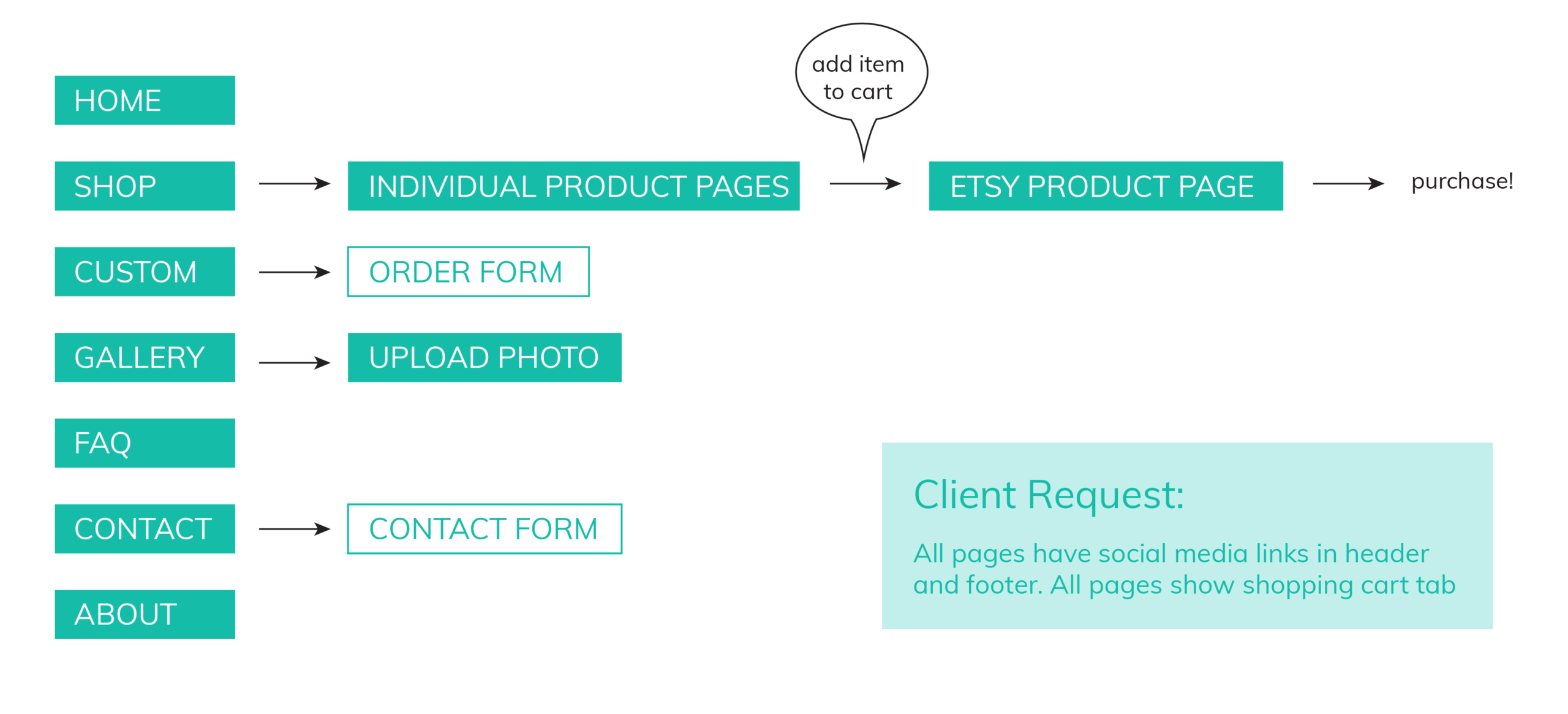
Page Flow Diagram
Common paths users might take:
- Browsing the shop listings and placing an order
- Requesting a custom design order
- Uploading a photo to the customer gallery
- Sending a message to the owner via the contact form
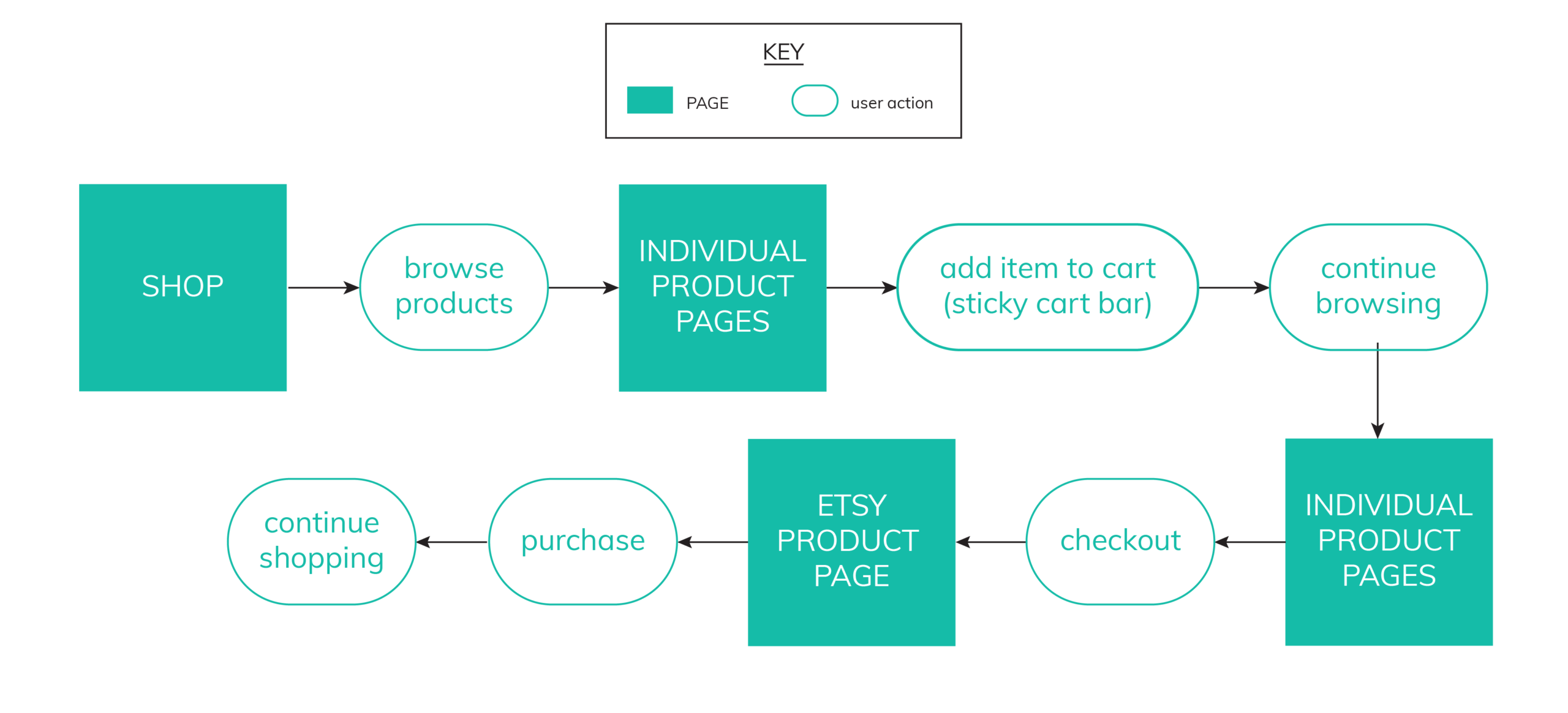
User Flow Diagram
Start-to-finish process of making a purchase. The user would be able to browse the catalog and place an item in their shopping cart on the website, and when they clicked ‘checkout on etsy’ they would be redirected to etsy to process the payment.
Low Fidelity Mocks
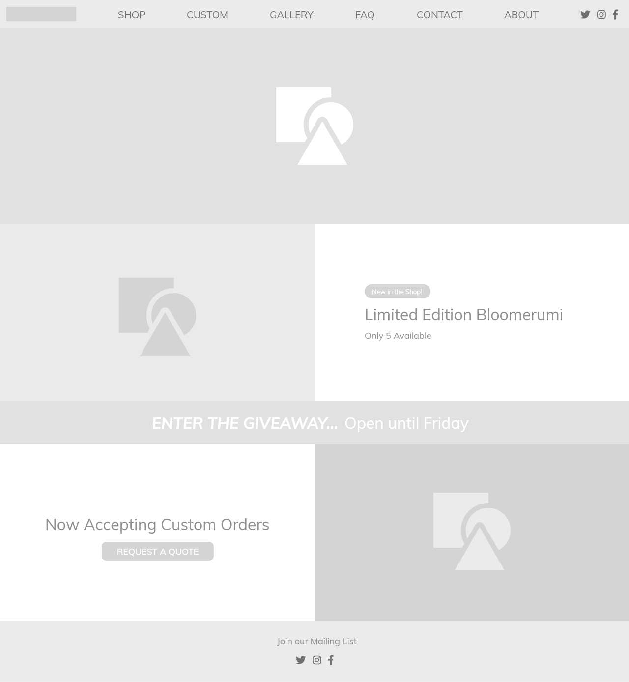
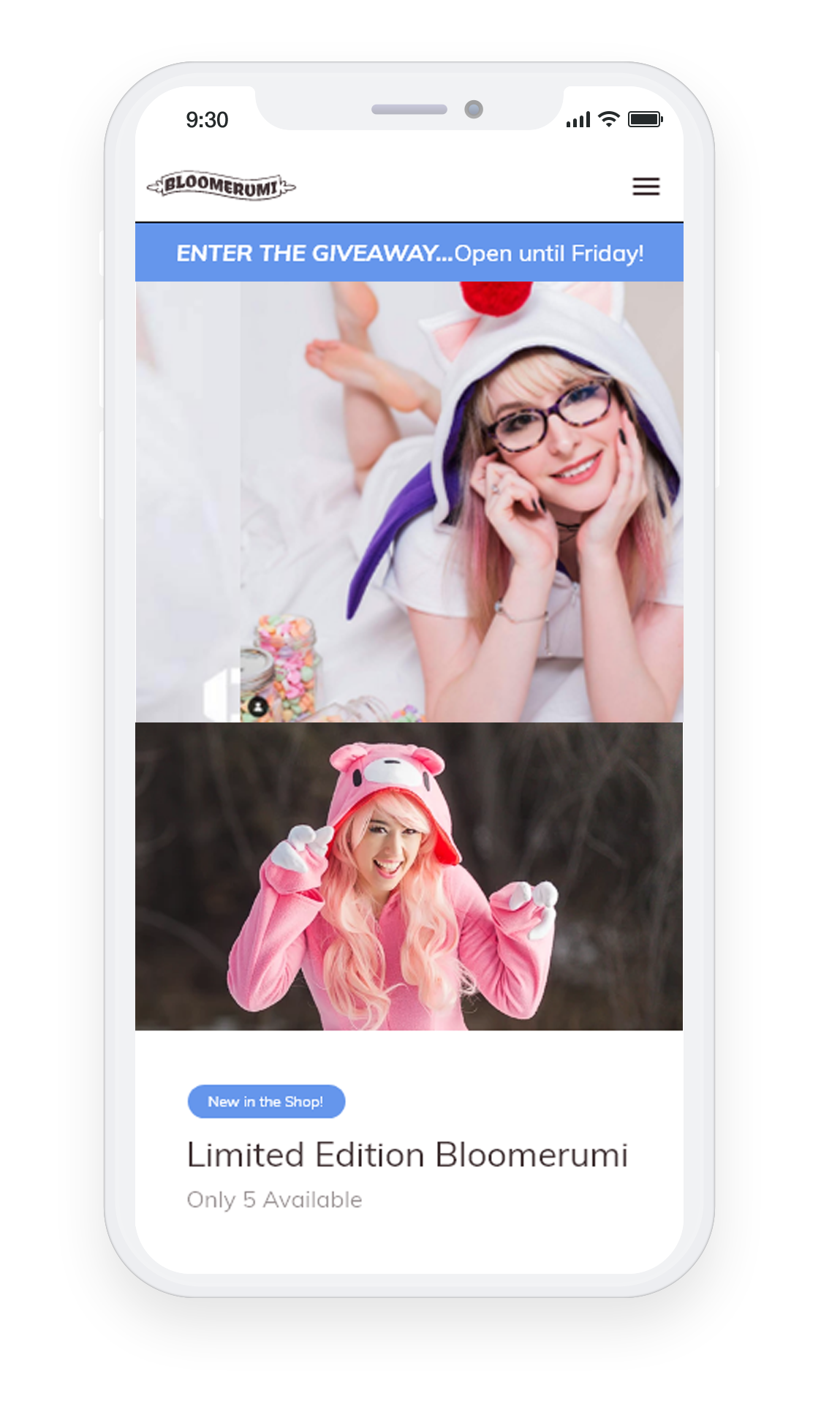
Homepage showcasing featured products, news and large high quality photos of people wearing the products.
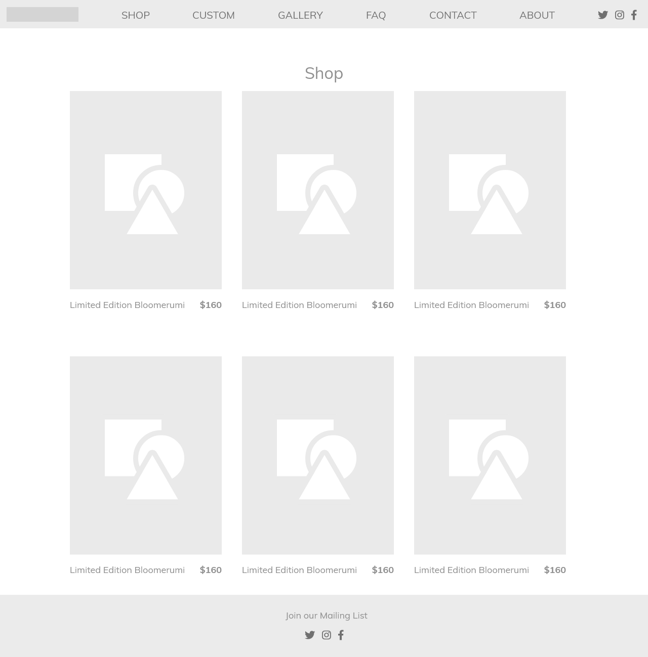
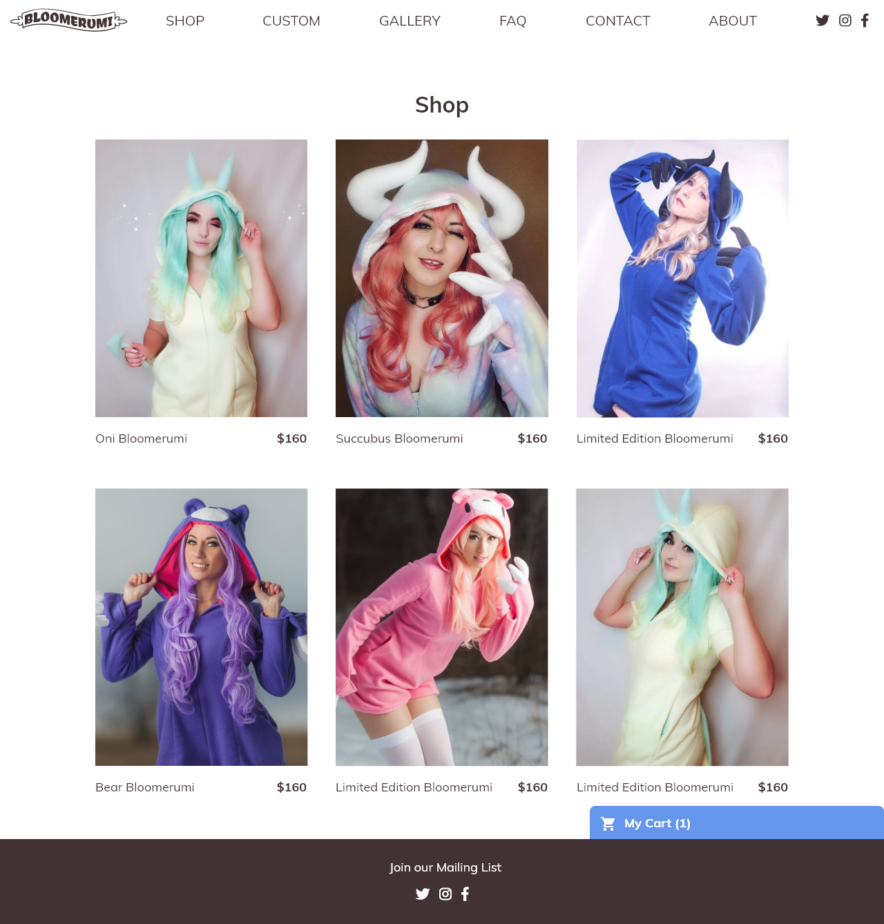
Shop page showing all product listings in grid layout. Large photos to show quality of the garments.
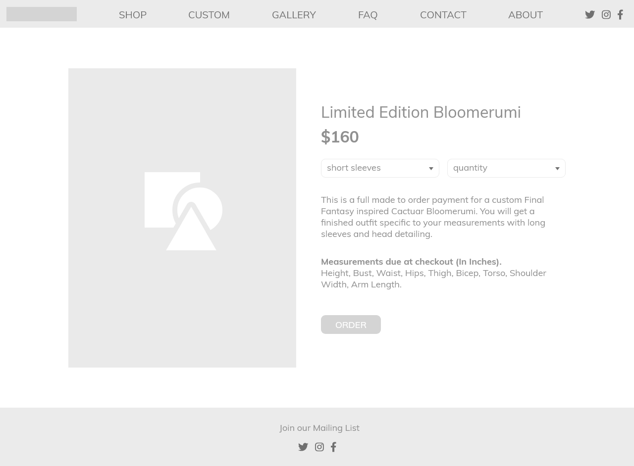
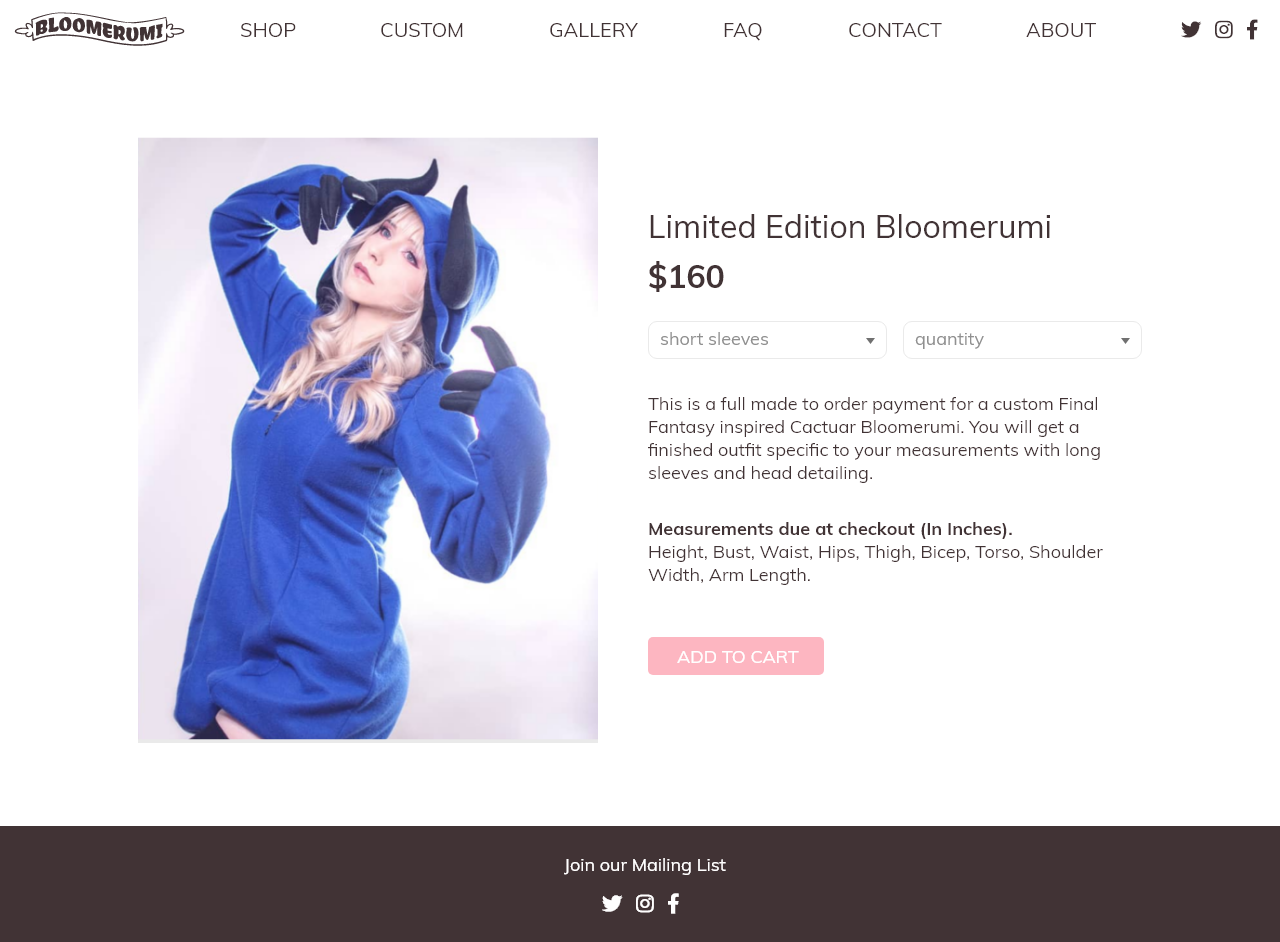
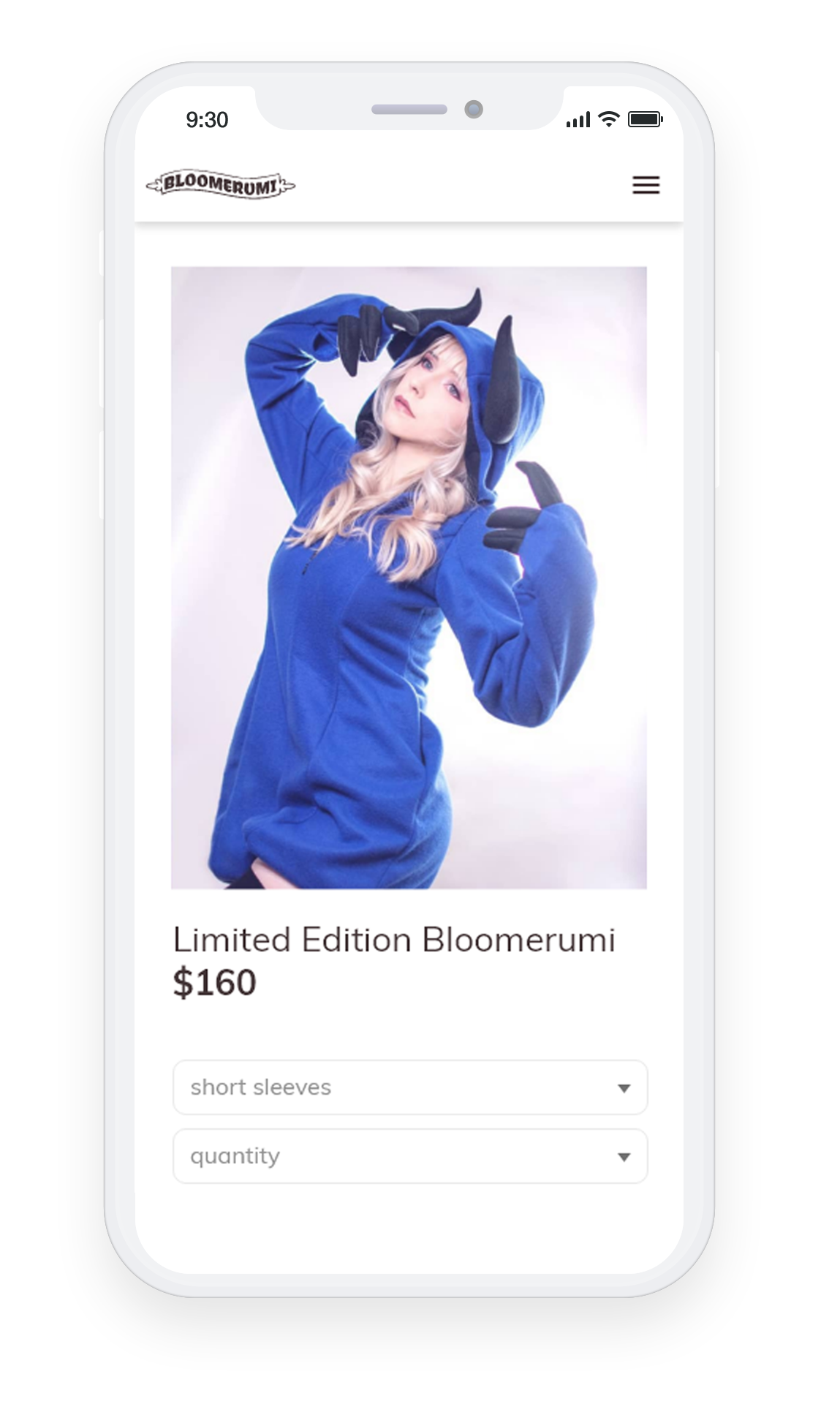
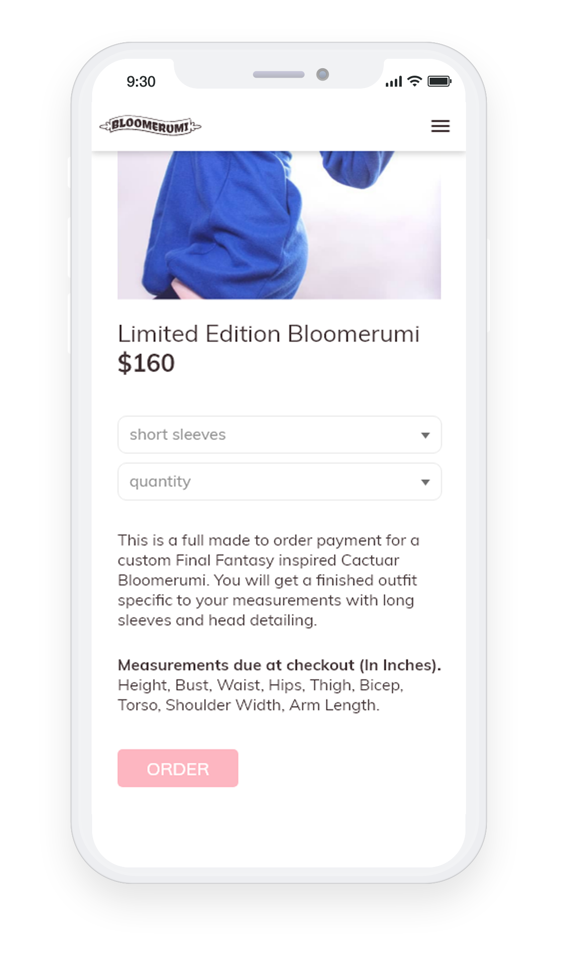
Product page showing individual listing details, color and design options, and button to add to cart.
Client Review
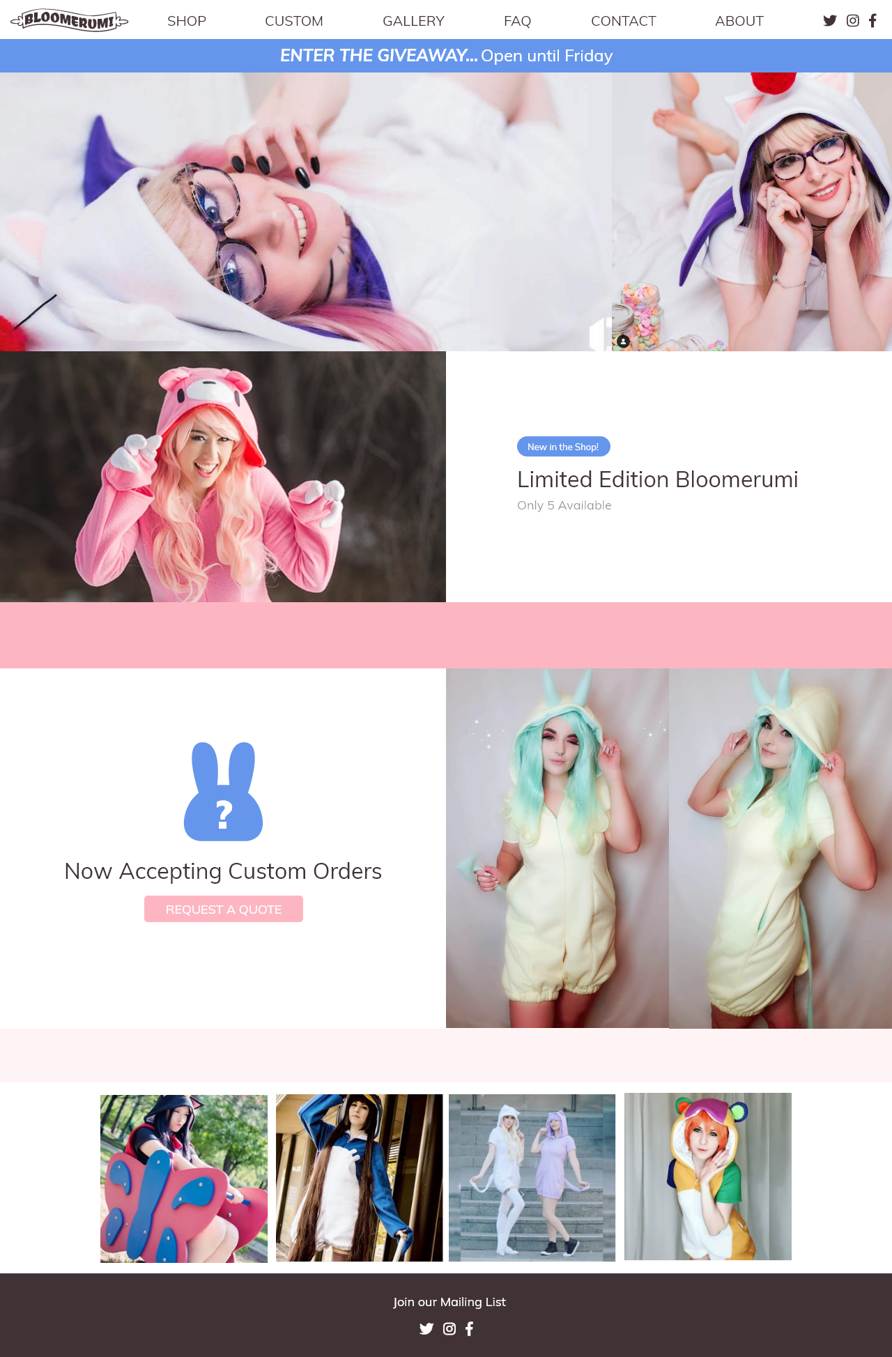
Reviewed site structure, layout and visual design with client. She loved the organization and workflow, and made a few more requests. She wanted an announcement banner at the top of the homepage where she could post short headlines about upcoming promotions or special events. She also requested an instagram feed at the bottom of the homepage that would automatically update with her most recent posts. After making these updates I send her over a high fidelity set of mocks. After a few small changes she approved them and I put the site together in wordpress.
High Fidelity Mocks
Shop page
Product Page
Testing & Results
I showed the client the fully built-out site and asked her to play around with it, think about it for a few days, and try to break it. She was thrilled with the look and feel of the site, and the easy editability of the home page.
The client and I asked multiple users of different ages and technological abilities try to use the site. We asked them to report any instances where it broke, behaved unexpectedly or illogically, any time it looked strange, and any other thoughts they have. I also tested in major browsers and across multiple devices (phone, tablet and desktop at least).
I made minor updates based on testing results, and trained the client on how to manage the site from the admin area.
I checked in with the client after 3 months and she reported positive user feedback on the mobile usability of the site, and a decrease in direct messages to her about information covered in the FAQ page.

