Design System
for an enterprise web application
My Role:
I was the sole UI/UX Designer on this project. I worked closely with the product owner as he set requirements and signed off on designs, and I collaborated with the development team to refine designs based on the application’s framework.
The User:
A business user at a large company who needed to manage very large data sets on a daily basis. They needed an application that made it easy to compare many lines of numerical data.
The Project:
Create a tool to organize and manage complex data sets. The user will be interacting with this tool on a daily basis, most often looking at large data tables. There will be complex functionality so the challenge is creating a clean interface that clearly shows the tools available, but is not cluttered or overwhelming.
My Approach:
I prioritized clean design and consistent components and interactions, and tailored my designs to the frameworks that the dev team decided to use. Consistent treatment of UI elements would be critical to help users quickly learn and recognize functionality, as well as less code for the developers to write.
My Strategies
- Clean design making use of white space and nearly monochromatic color scheme to ease the visual noise of large grids
- Consistent UI components and interactions, both for user clarity and ease of development
- Develop a style guide as a reference for design decisions
Design System
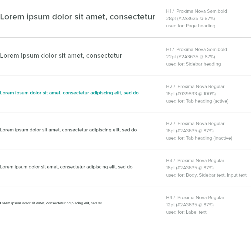
Typography
Color

I approached the color design by first interviewing stakeholders about any concerns or limitations they already had in mind. Were there certain colors we needed to use or coordinate with for branding reasons? Were there colors already used by competitors that we should avoid? In this case we didn’t have any such limitations.
I did some market research of our competitors’ branding as well as the predominant color psychology theories relating to our industry. Blue is the most commonly used branding color in our field, potentially making it hard for us to stand out if we use it. I wanted to incorporate the implications of stable reliability associated with blue, as well as themes of growth and wealth associated with green. I went with a bright, cheery teal.
While this bright teal is highly effective as a branding color, the color scheme to be used in the actual user interface must be treated differently. While logos and marketing materials often need to stand out and grab attention, the best user interfaces are subtle and do not distract from the tasks they are made to facilitate. I used shades and tints of the teal for most of the UI, and the bright color only for calls to action and items that needed to stand out.
Iconography
Icons come from Material Icons and Font Awesome icon fonts. In most cases Material Icons are 24px and Font Awesome Icons (which on average run a little larger) are 22px. When larger sizes are needed use 28px/26px; when smaller sizes are needed use 18px/16px. Icons should have at least 18px of padding on all sides.
Components
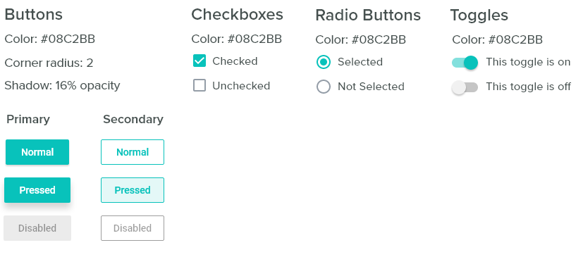
The standard components all use the same call-to-action color, #08C2BB. Since choosing branding colors, I adjusted this main teal to be a little darker so white text would be more readable on the buttons.
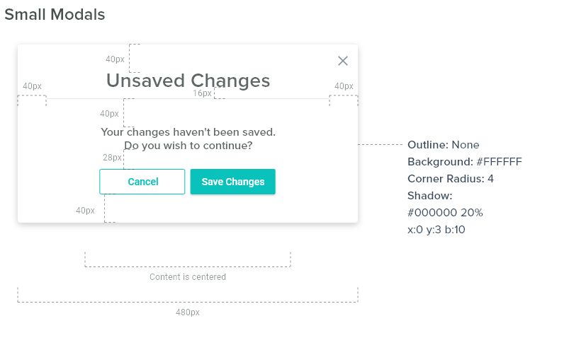

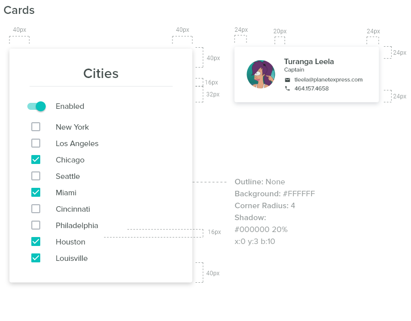
Interaction States
Simple Table
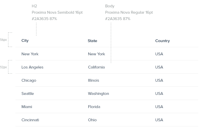
The challenge with the table design was to account for large grids of data while minimizing noise. We went through iterations from zebra striping, with and without verticals, and different sizing and line height.
Dense Table
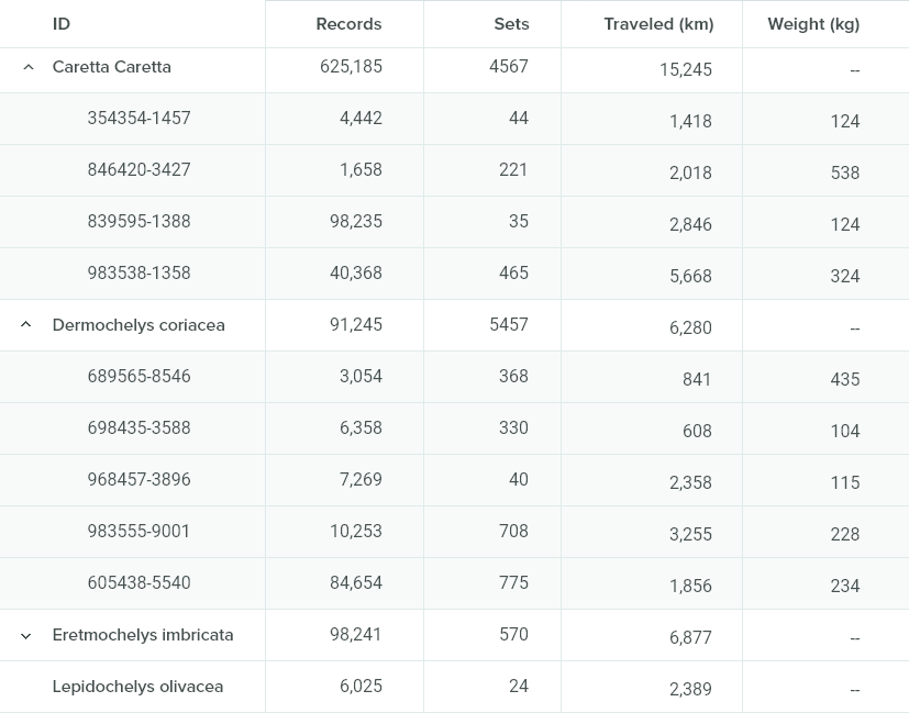
When we got to working with the denser tables we needed to address a few new challenges:
- Show more columns and rows on the page
- Show hierarchy of items
- Expand/Collapse parent items
I researched best practices for complex data table design, and implemented the following strategies:
- Align text data left, numerical data right with decimal aligned. This makes it easy to visually scan and see differences in value.
- Pay attention to the ‘data-ink ratio’. This is the ratio of visual noise that is not actual data (background fills, border lines, etc.) This ratio should be as small as possible. I decided to use a light gray background on child items, and light vertical & horizontal border lines to differentiate between cells.
- We used the carrot symbol to expand/collapse rows. The presence of the symbol, as well as the indentation, differentiates between parent and child rows.
Dense Table: Edit Mode
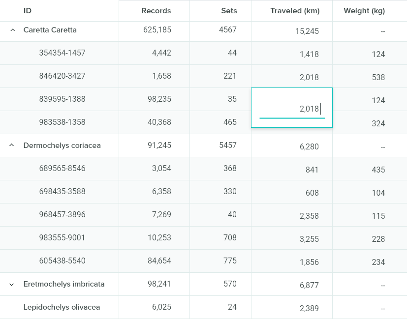
Feedback
This is an ongoing project currently still in development. Feedback from stakeholders has consistently confirmed that they expect the application will save their businesses a significant amount of time and money. They also commented that the interface is cleaner and easier to understand than their current tool. There are less steps required to complete a task and more robust functionality.
